Case study
Food Logging with Kaira
Good logging feels like talking, not filling. So I stopped designing a form.
Sole product designer, GoodFlip. A metabolic health platform helping thousands of people manage chronic conditions.
- 92.5%
- positive feedback on Kaira’s responses
- 172 of 186 rated responses
- ~9 in 10
- log with Kaira on their own, without a coach or diet plan
- from a backend export, ~900 Kaira users over 10 months
Why we needed to build this
Food logging was not a small feature. It was the one bet that pulled on acquisition, retention, positioning, and metabolic leverage at once.
-
Only coached users logged
The data showed food logging happened almost only where a coach pushed a user on a plan. Left on their own, people did not log.
This is the exact thing Kaira later reversed. See the outcome. -
Nutrition is the leverage
Nutrition is a core pillar of metabolism, so a logging habit was leverage we were leaving on the table.
-
The category demanded it
Competitors already had AI-powered logging and users expected it. We could not even market ourselves in the space without it.
-
A wider top of funnel
Easy, low-effort logging is the kind of entry point that widens the top of the funnel and brings new users in.
-
A reason to come back
A daily logging habit gives people a reason to return, which is exactly the retention we needed.
I pitched a chatbot, not another feature
The ask was AI-powered food logging. I pitched something bigger, a chatbot, and we went with it for three reasons.
-
Scalability
A chatbot was not a one-off feature. It was a surface we could extend into any other part of the app later, so the effort compounded instead of ending at food.
-
A personality to market
A chatbot could be given a character and a name, which handed marketing an angle a plain logging feature never could.
- Hypothesis
Familiarity (our hypothesis)
If people learned one Kaira experience for food, they would already know how to use Kaira everywhere else we took it. One learned interaction, reused across the product.
Process in a nutshell
Before the decisions, here is how I work by default. This is my operating system, not a checklist I ran once. The case study below is where I show which of these I leaned on hardest, which I skipped, and why.
Hover each step to see it in action.
Decision one
Don’t build a form, study how people talk
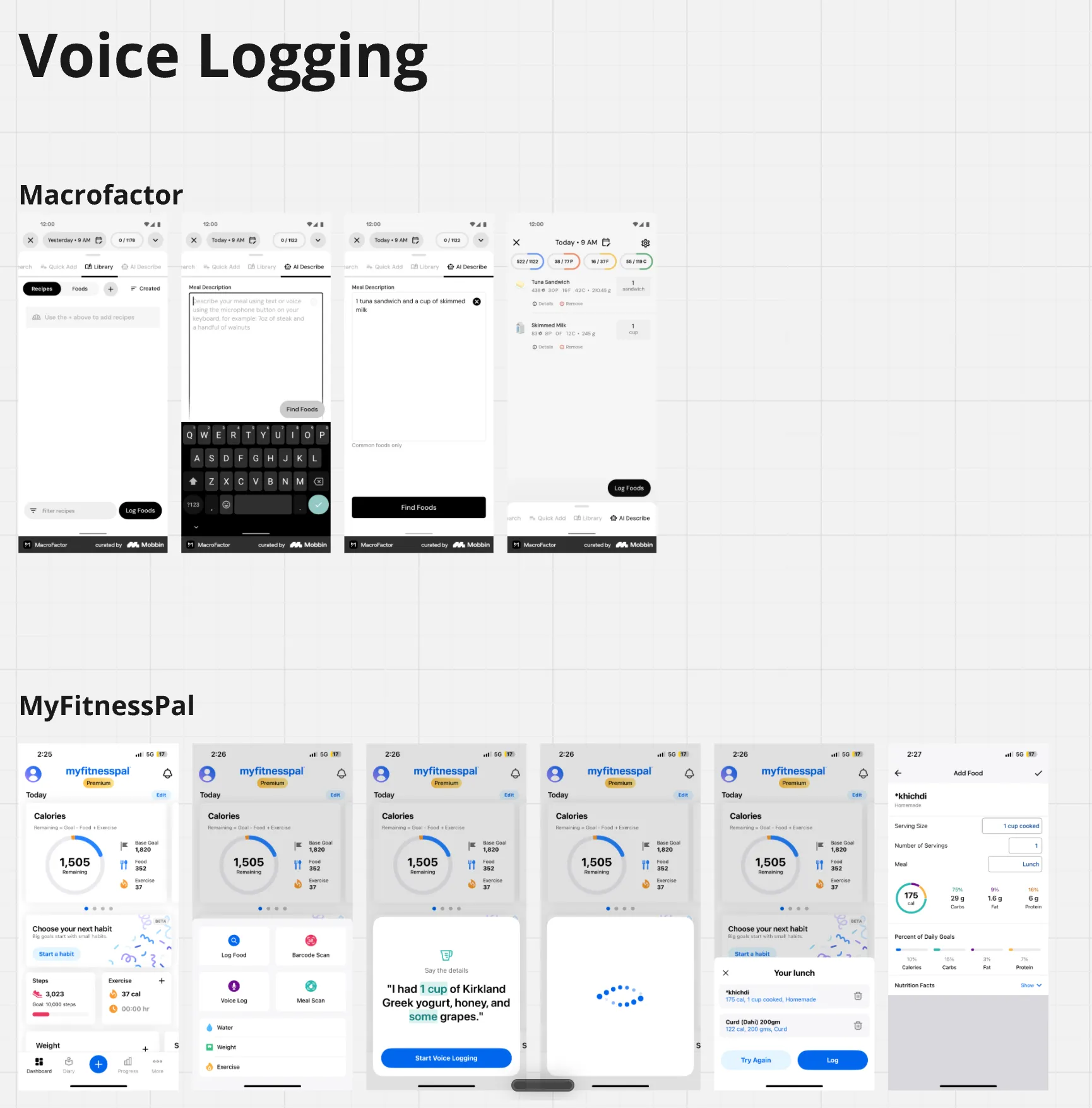
The easy version of this project was a cleaner form. I did not start there. A chat is only as good as its grasp of how people speak, so I started by listening.
I ran a small voice study with people around the office, two tasks each. First, describe everything you ate and did yesterday, in your own words. Then a single nudged prompt: what did you have for lunch today? The gap between those two answers was the whole project.
| What I heard | What it meant |
|---|---|
| Open prompt: people narrate chronologically, mix languages, measure in bowls and “a little bit,” and skip quantity, timing, portion, and sleep. 12 to 58 seconds, often hesitant. | Natural, but data-poor. |
| Nudged prompt: one specific question, and people get faster, more confident, more structured. 10 to 20 seconds. | Structured, but rigid if you ask too much. |
| The tension | Open voice is natural but data-poor. Nudged voice is structured but rigid. Neither works alone, the design has to be a hybrid: let people speak, then infer, and nudge only for the few things you cannot assume. |
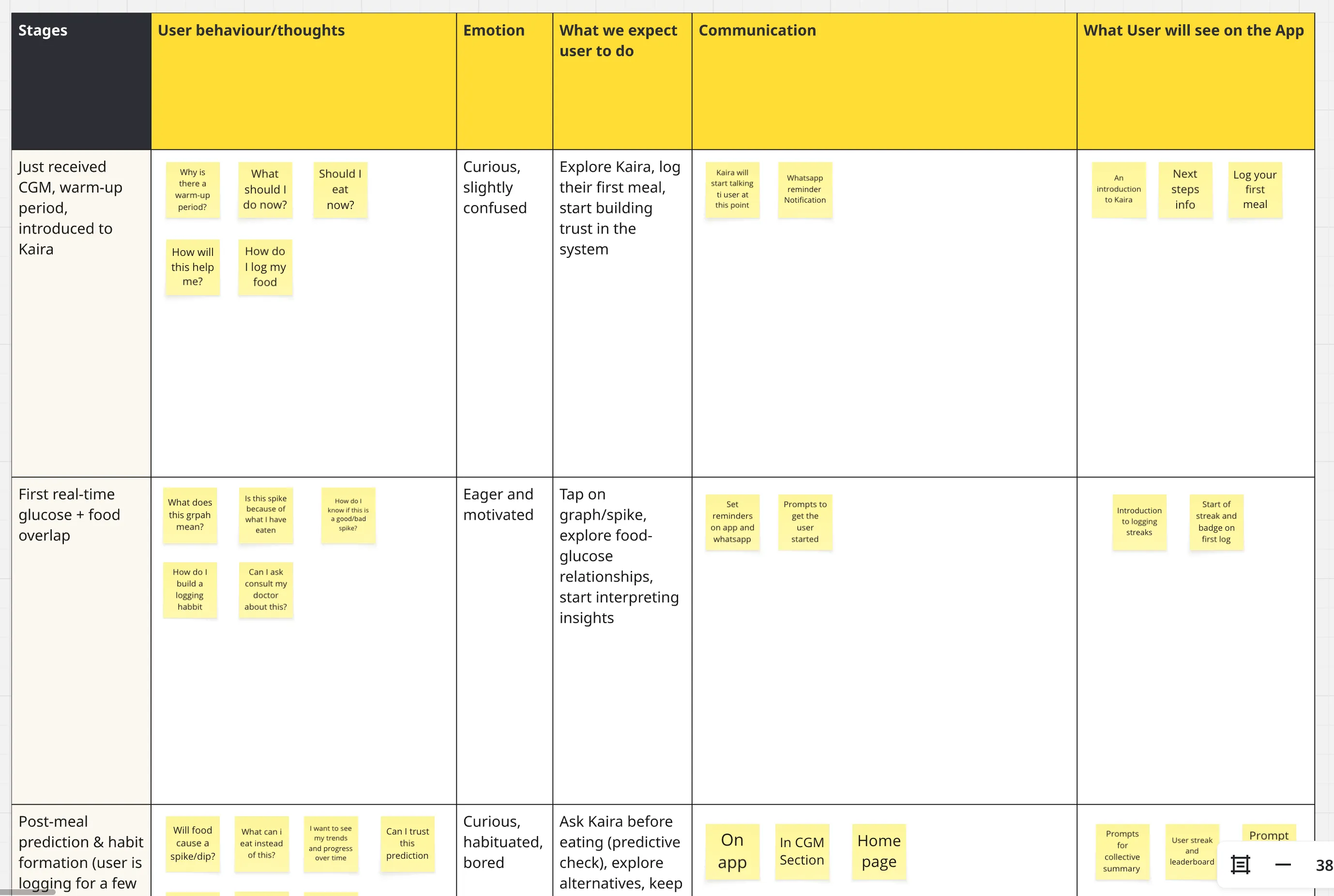
Then the emotional side. Logging is not only a data problem, it is an emotional one. One of the ways people landed in the food logger was through their CGM journey. Someone sees a glucose reading, wants to know what caused it, and that curiosity is the doorway into logging. So the emotional map I built follows that CGM-triggered path, from curious and unsure when the reading first appears, to motivated, to bored once logging turns routine, to anxious when a bad number shows up, to guilty when they break the streak.
Decision two
Infer, don’t interrogate
If speaking freely leaves gaps, the obvious fix is to ask more questions. That is also the fastest way to make people quit. So I built the opposite. Let people speak however they naturally do, then infer the missing structure instead of demanding it.
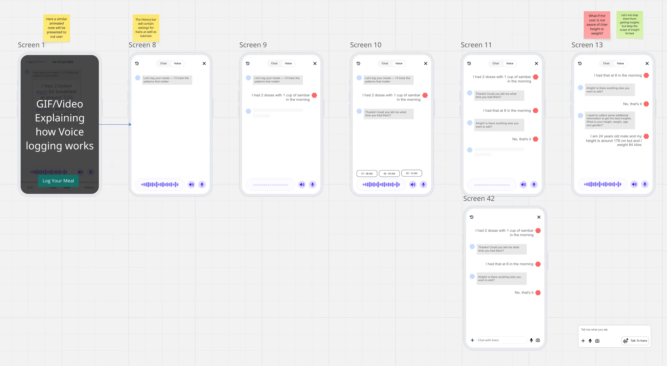
I went through every field a log needs and split it in two. What Kaira must ask, and what she can safely assume. For everything assumable, I wrote the fallback logic behind it: pull from the user’s coach plan, then their own history, then population defaults, and reason from scratch only for the genuinely odd inputs.
There was exactly one field I refused to let it assume: meal type. Because people log at the end of the day, “poha and chai” could be breakfast or an evening snack, and getting that wrong quietly poisons the data. So Kaira always asks that one thing and assumes the rest. That single no is the design.
I also designed a flow for logging several meals at once, for the person who dumps their whole day in one go. It was cut for dev effort before launch. Remember this one, because the data brings it back later.
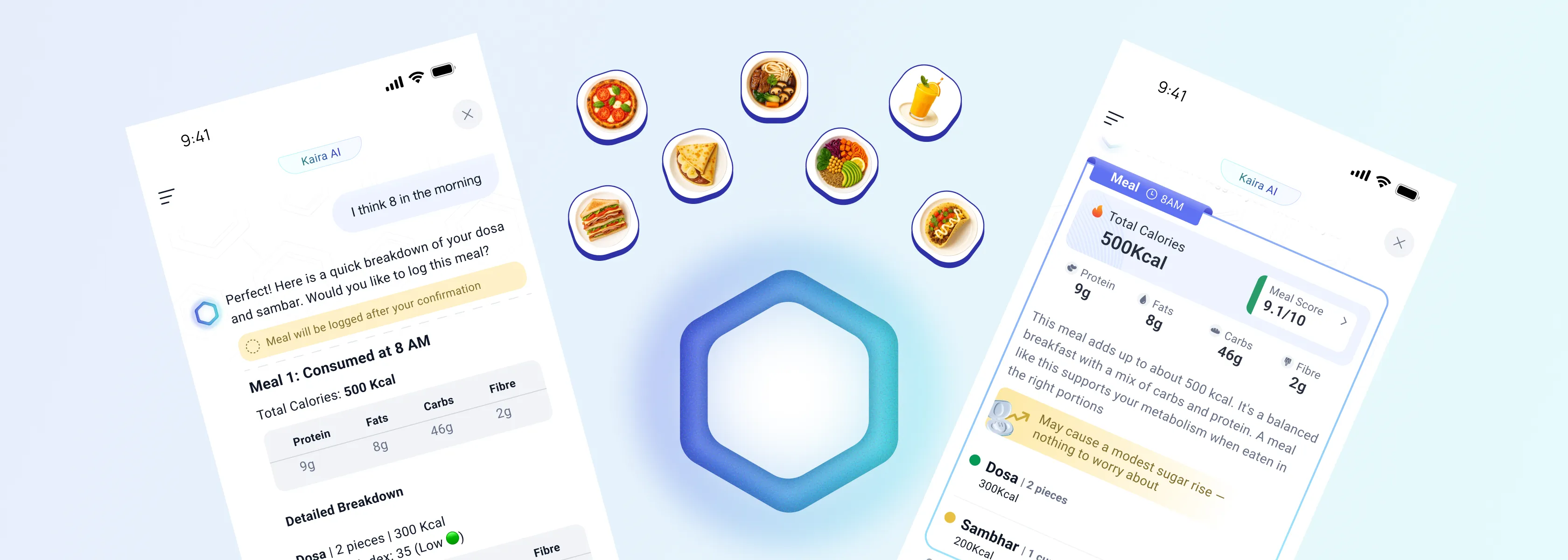
On top of the capture sat the part I care about most: what Kaira says back. I built the response to scale to how someone logged, whether a single item, a full meal, or a whole day, and to always end on the one thing a metabolic platform cannot leave out, the likely sugar spike. Same voice, right-sized to the input.
Decision three
Giving Kaira an identity
KAIRA
Knowledgeable AI for Remission and Awareness
-
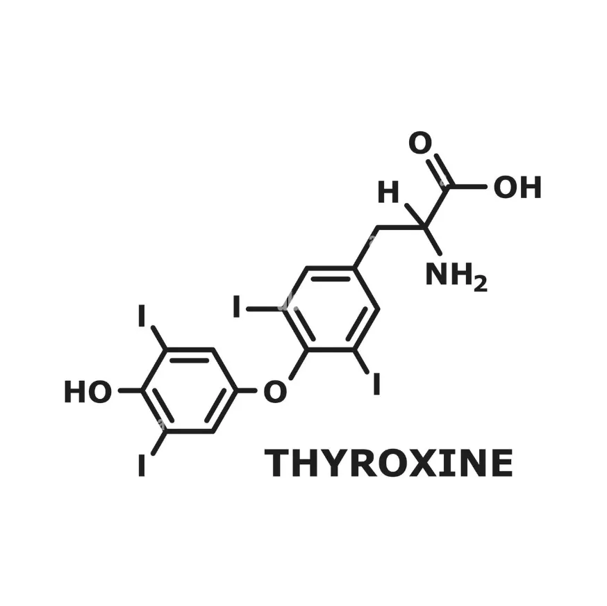
Rooted in the science
Thyroxine, the hormone at the center of metabolism, is built on a hexagonal ring. The identity starts there.
-
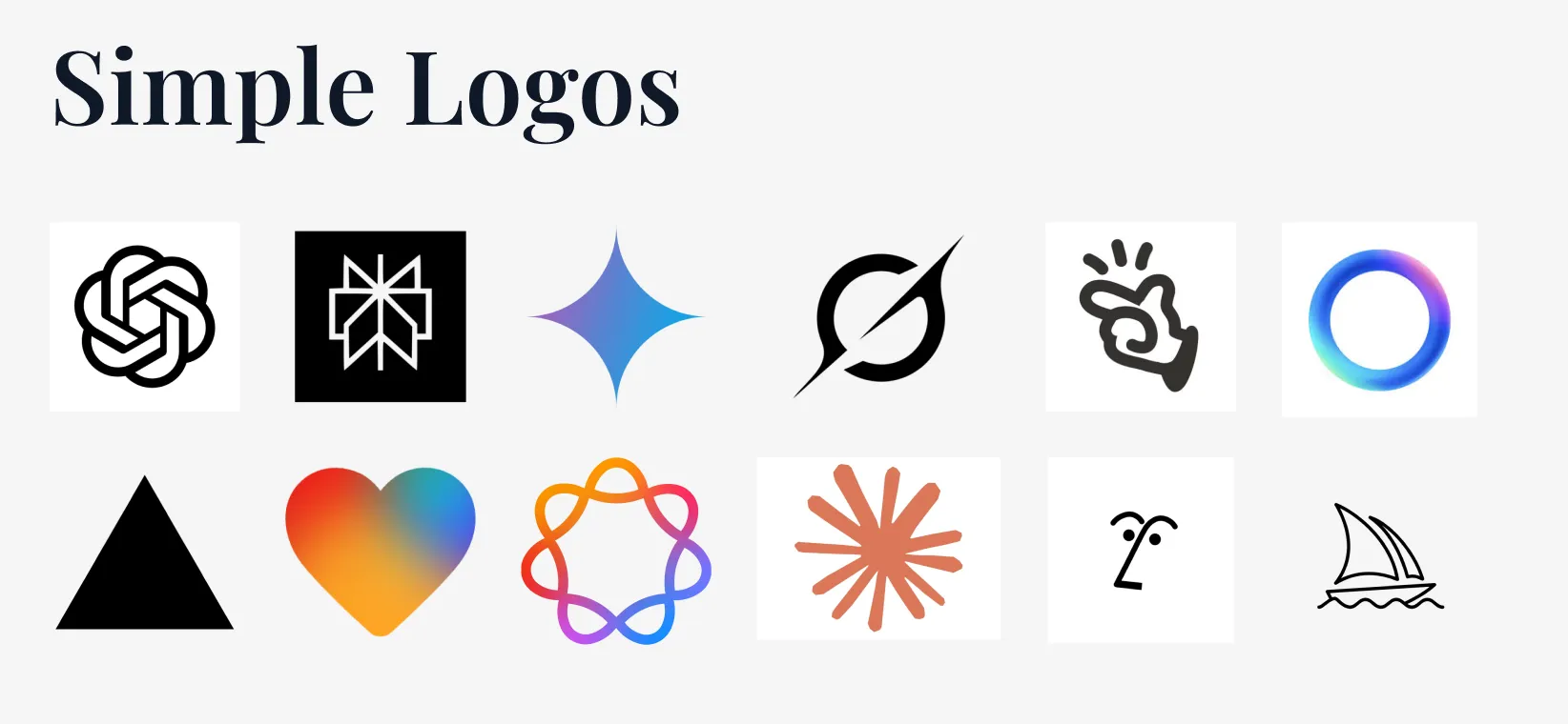
Built to be recognisable
Competitive analysis showed AI marks trending busy and over-clever. I chose a simple hexagon anyone could recognise instantly.
-
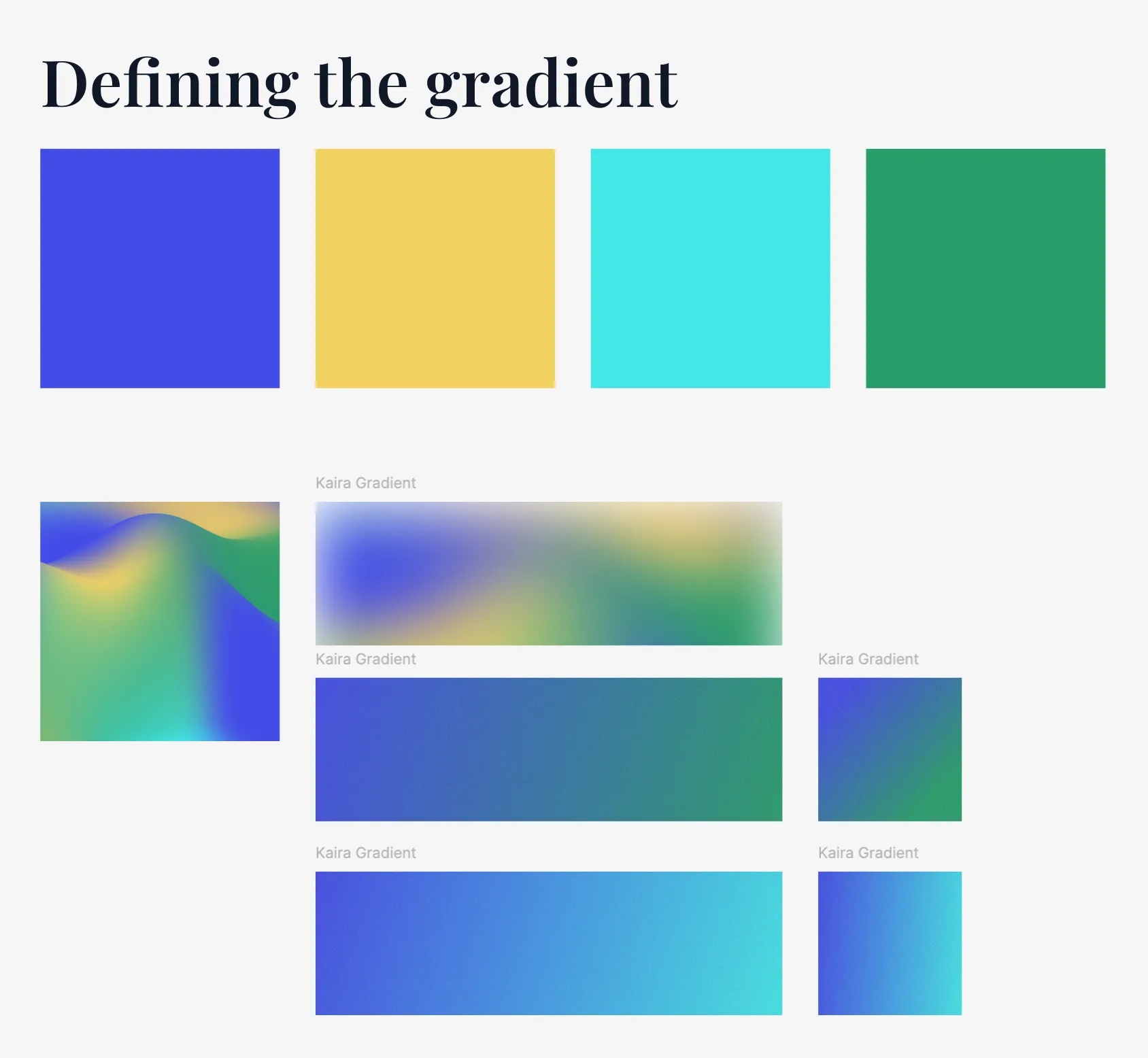
Colour from our system
The gradients came from our existing design system, so Kaira felt native to the product, not bolted on.
-
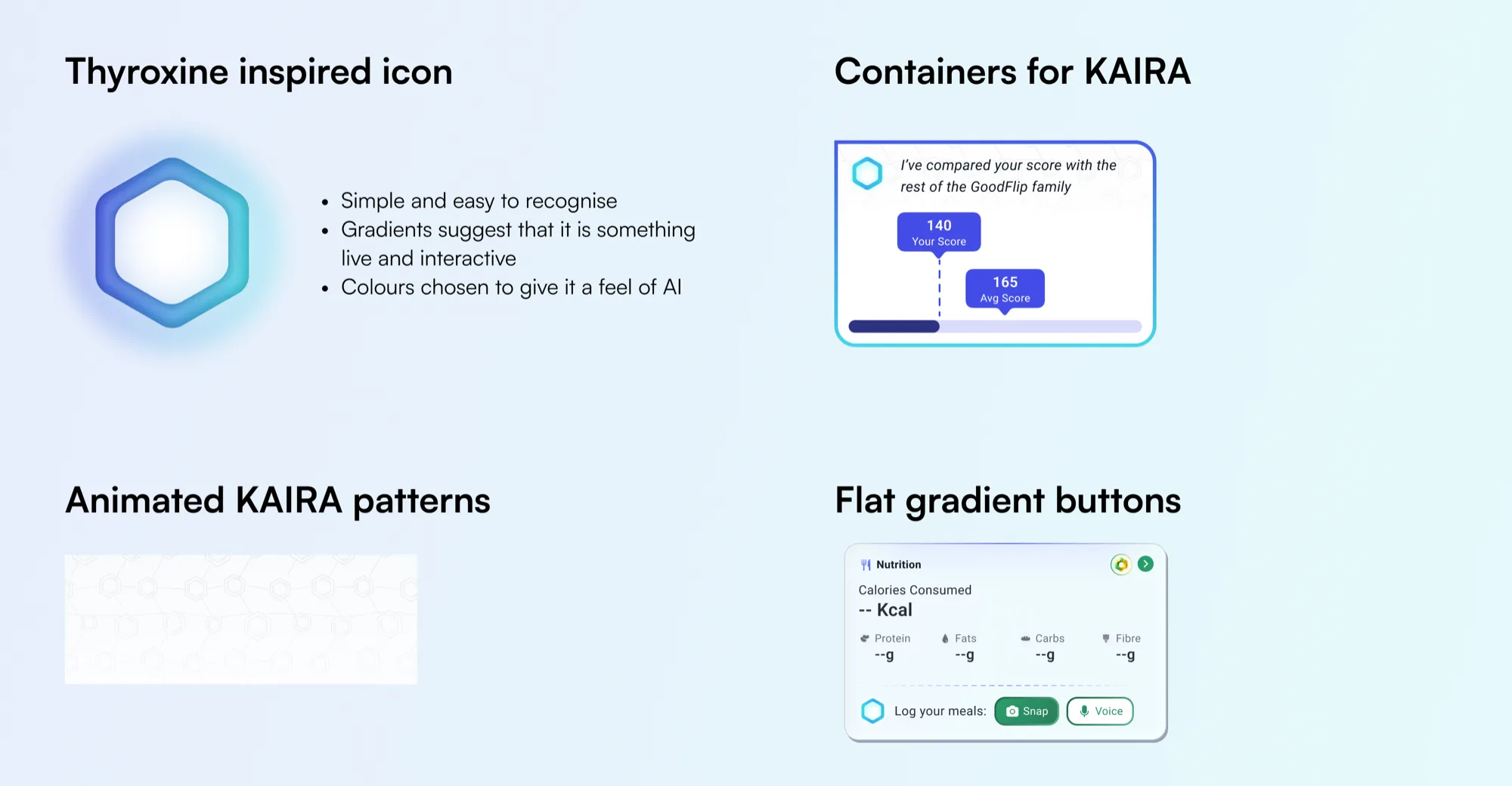
A pattern with the same DNA
The surrounding pattern is drawn from the same thyroxine geometry, tying the whole identity to one idea.

-
The result
One clean, scientific, recognisable mark.
Other directions I explored
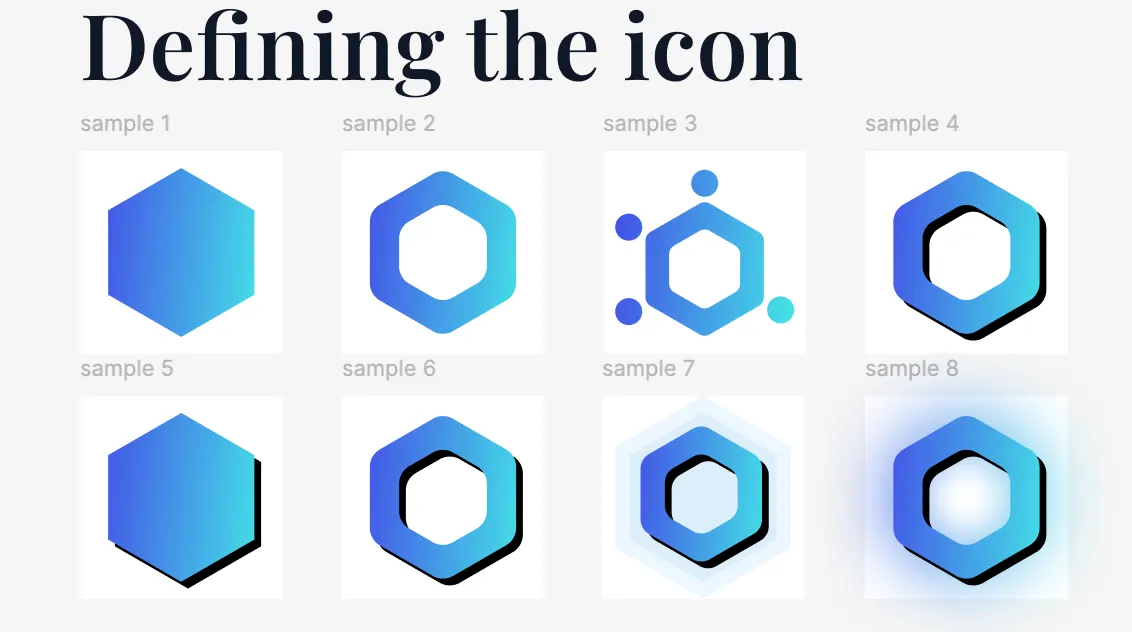
See it in action
Enough logic and stills. Here is the thing working, end to end.
The honest part
The version I designed was richer than the version we shipped, and that was a deliberate call. To go live on time, we chose the leaner build we could stand behind now over the fuller one that would have held the launch. Shipping and learning beat polishing in private.
Three things I had designed were held back for the first release. The rich, card-based meal breakdown, with its per-item cards and tables, shipped as standard text and table answers instead. The Meal Score, a single at-a-glance read of how good a meal was, was set aside. And batch logging, the flow for dumping a whole day at once, was deferred. Each was a conscious trade to get a working product into people's hands, not a limit on what could be built.
I would rather name that plainly than pretend the shipped thing was the ideal thing. Knowing the difference, and choosing what to sacrifice under a real constraint, is the job.
Decision four
Ship it, then let the data prove me wrong
I saw it coming
I had designed a multiple-meals flow for exactly this. It was cut for dev effort. The data made the case I could not.
The data corrected me
I built for voice. People reached for text first, camera second. Voice, the input I centered on, was the smallest. Users told me something I had not assumed.
What I did with it
I delivered this as a ranked, evidenced roadmap to the CTO and stakeholders. It pushed the team onto the three biggest fixes: response speed, batch logging, and letting Kaira answer real questions. I owned the problem and the direction, not the engineering that followed.
Outcome and reflection
The bet, measured
The problem I opened with was that people only logged when a coach pushed them. After Kaira, that flipped.
- ~9 in 10
- log on their own, off any diet plan
- up from logging that was almost entirely coach-driven
- ~4x
- growth in monthly self-directed loggers
- roughly 60 to 280 a month, Jan to Jun 2026
- 1 in 4
- came back to log on 5 or more separate days
- without any prompt to return
Figures from a backend export of roughly 900 Kaira users over about 10 months. Directional, not final.
Beyond the numbers, food logging became GoodFlip’s first working proof of an AI-first product, and a model the team could extend to everything else a person logs.
The reality is that food logging in chronic care is not solved. What this built is a foundation the team could see clearly, measure honestly, and keep improving.