Turning clinical data into metabolic health anyone can read
Let's start with some context
What's GoodFlip
GoodFlip is a metabolic health platform that empowers users to manage
metabolic conditions like obesity, fatty liver, diabetes, and PCOS
through doctor-led programs, nutraceuticals, smart devices, advanced
diagnostics, and personalized coaching.
What's a CGM
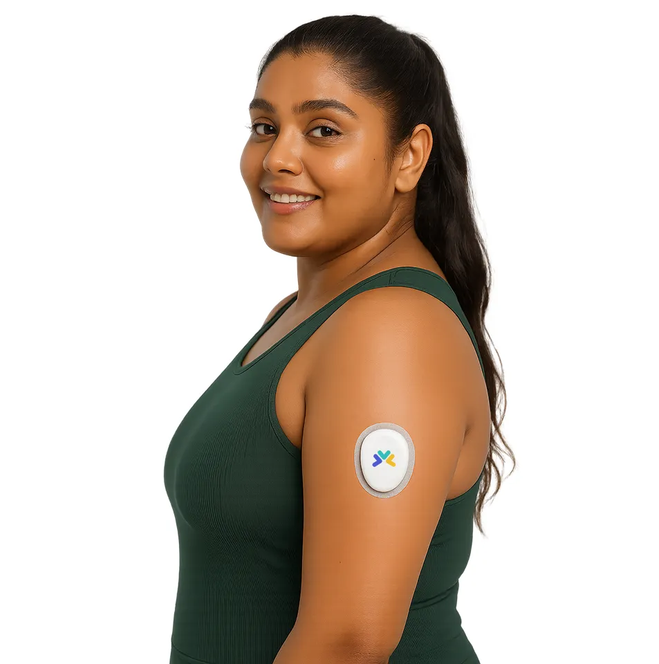
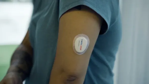
A Continuous Glucose Monitor (CGM) is a small, wearable device that
tracks your body's glucose (sugar) levels day and night.
Highlights of the project
77.6%
of people are able to complete the onboarding and connect with their CGM
78%
of the people come back at day 15 to check their vitals
My role in the project
I was the sole designer on GoodFlip's CGM, owning it end to end: the
initial research and success metrics, the onboarding and core metrics
dashboard, and the post-launch data that told me what to fix next.
Working alongside the clinical team to get the medical detail right
and pitching direction to stakeholders, I shipped the MVP, then used
what the launch data showed to rework the flow, adding an AI-powered
read of each user's day and their glucose spikes.
Experience the GoodFlip CGM
Your story
Imagine you're on your fitness journey, and you're having trouble
knowing which foods react how with your body. You see an
intelligent way to track your blood glucose on Instagram, and you
order our device. You open the app and continue your journey from
here.
1
You want to track your glucose data for your fitness journey.
2
You see a GoodFlip ad and purchase our device.
3
You install the app and continue your journey from here.
CGM onboarding flow
Daily the shared starting point Cumulative trends and progress Advanced the clinical layer
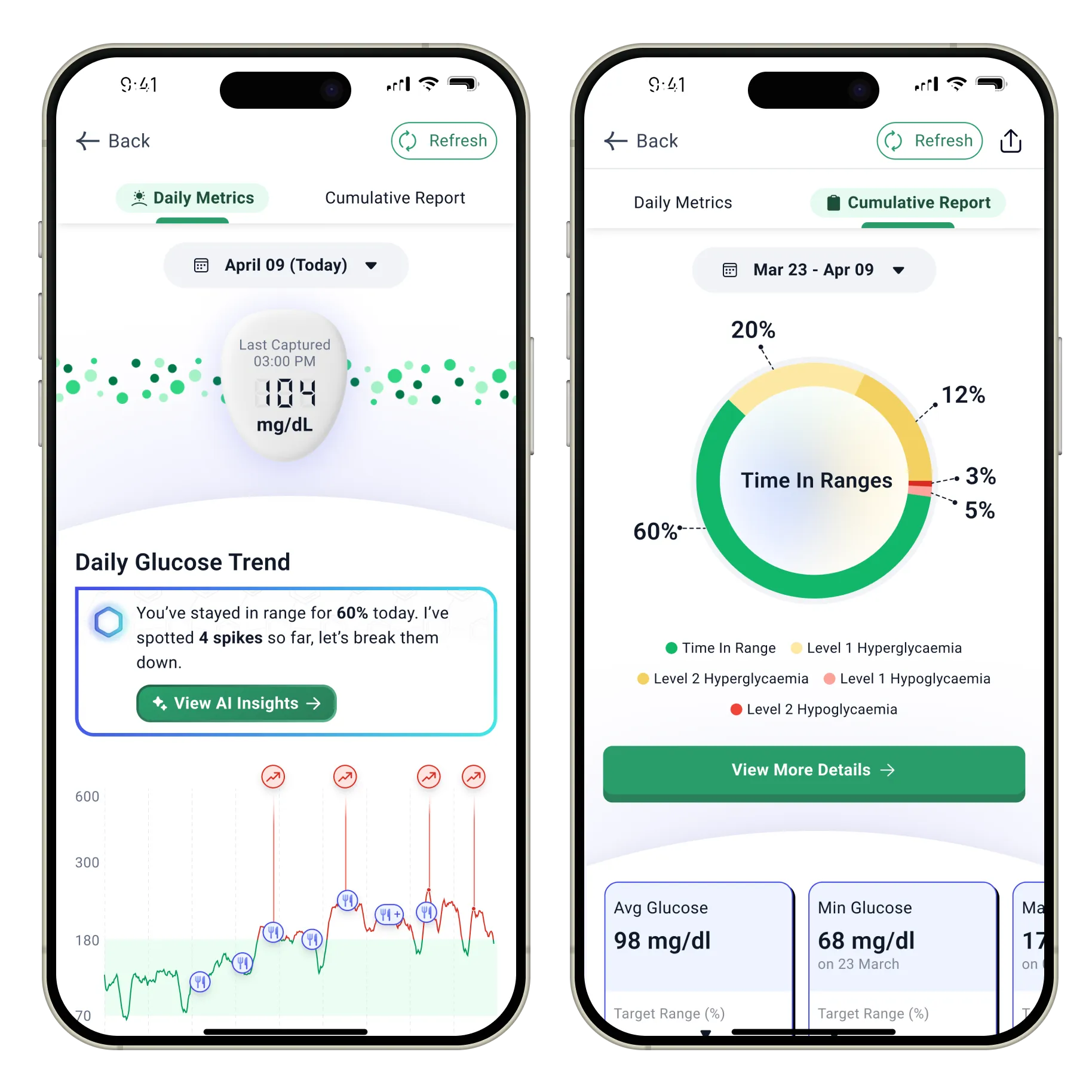
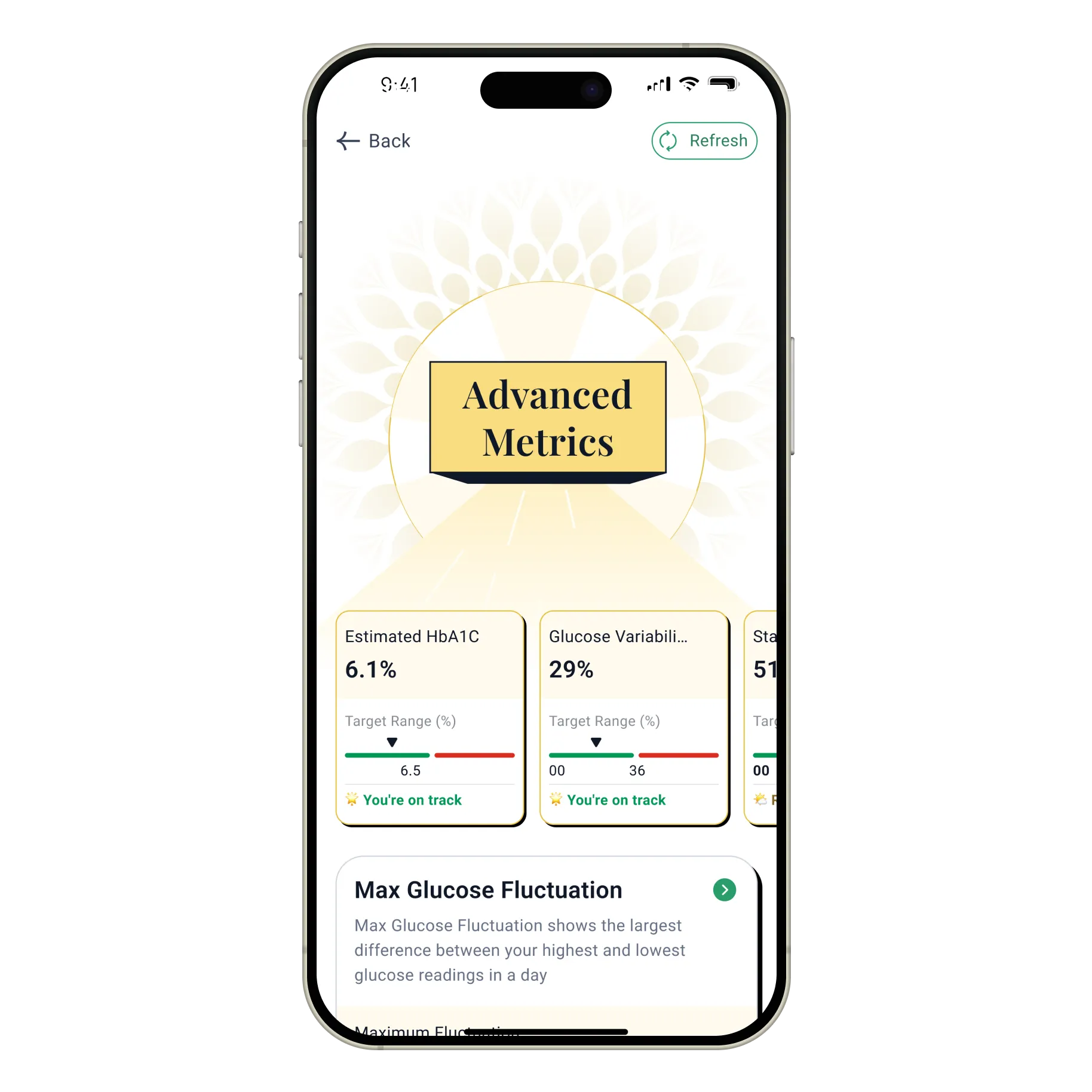
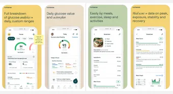
One dashboard, three ways to read it
The same glucose data, split into three depths for three readers:
a daily glance, a cumulative trend, and a clinical layer. Each
person lands on their own view without ever standing in someone
else's.
A bet on curiosity
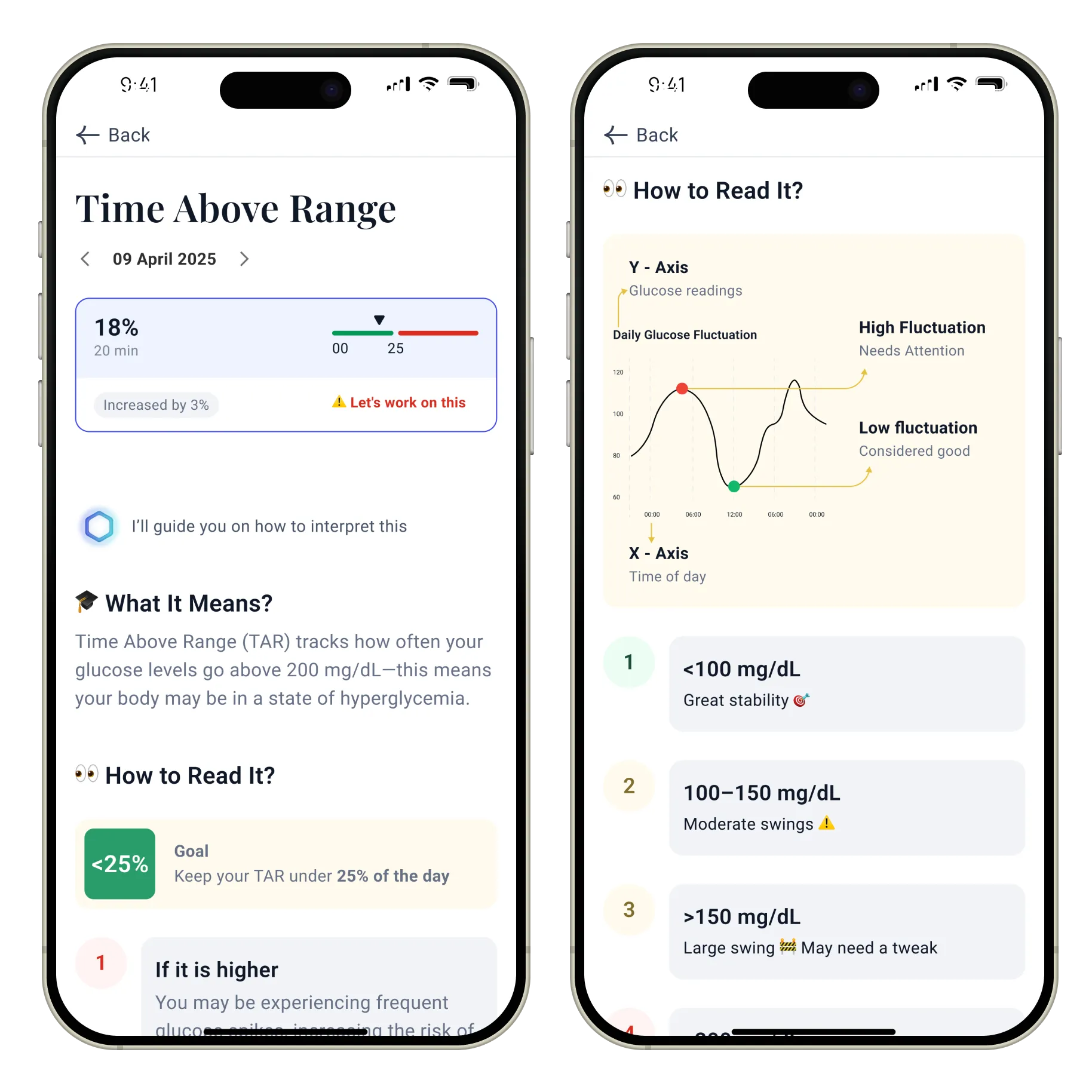
We chose to teach, not just display. Every clinical term gets
what it means, what good looks like, and how to read it.
42%of users opened at least one education screen
From what happened to why
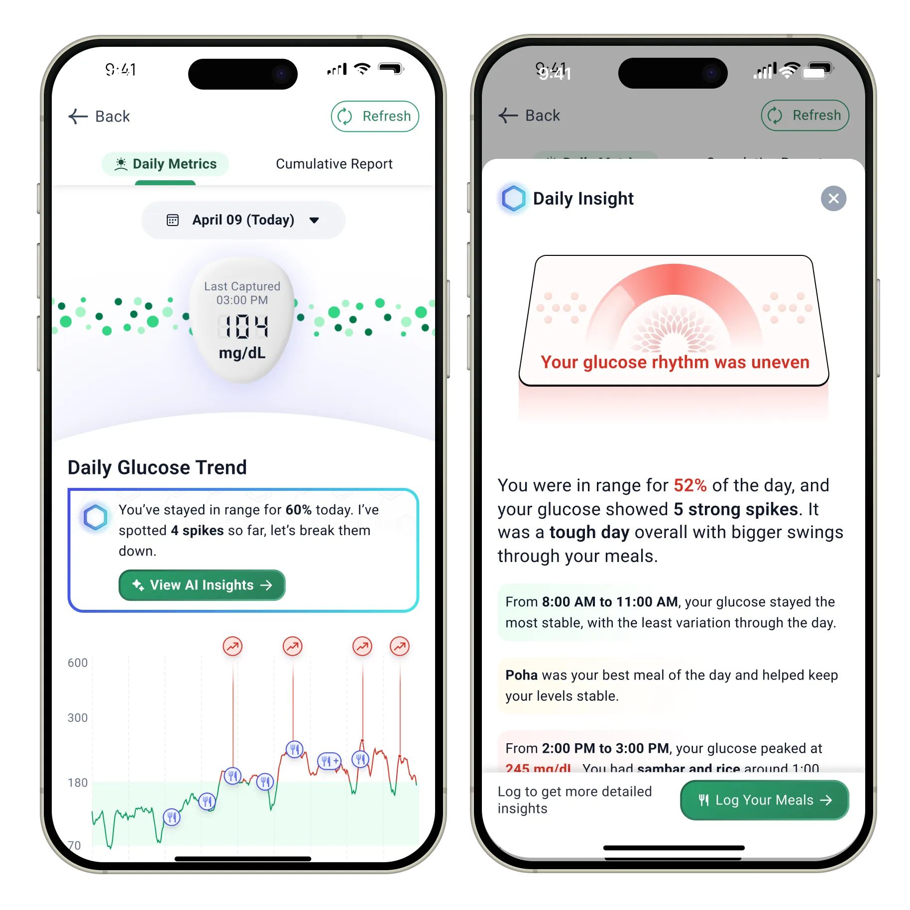
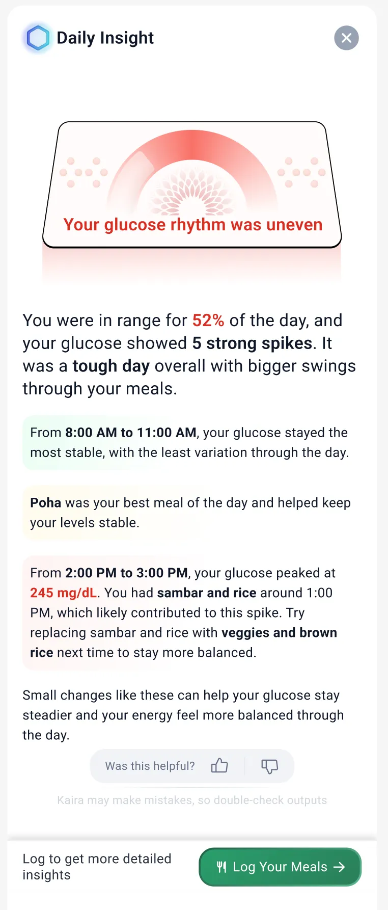
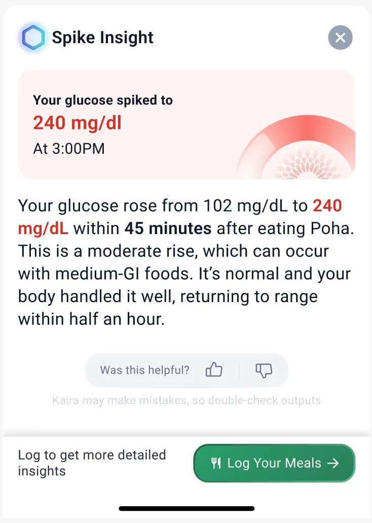
The dashboard shows the spikes. Kaira explains them in plain
language tied to real meals, then prompts a log so tomorrow's
read gets sharper.
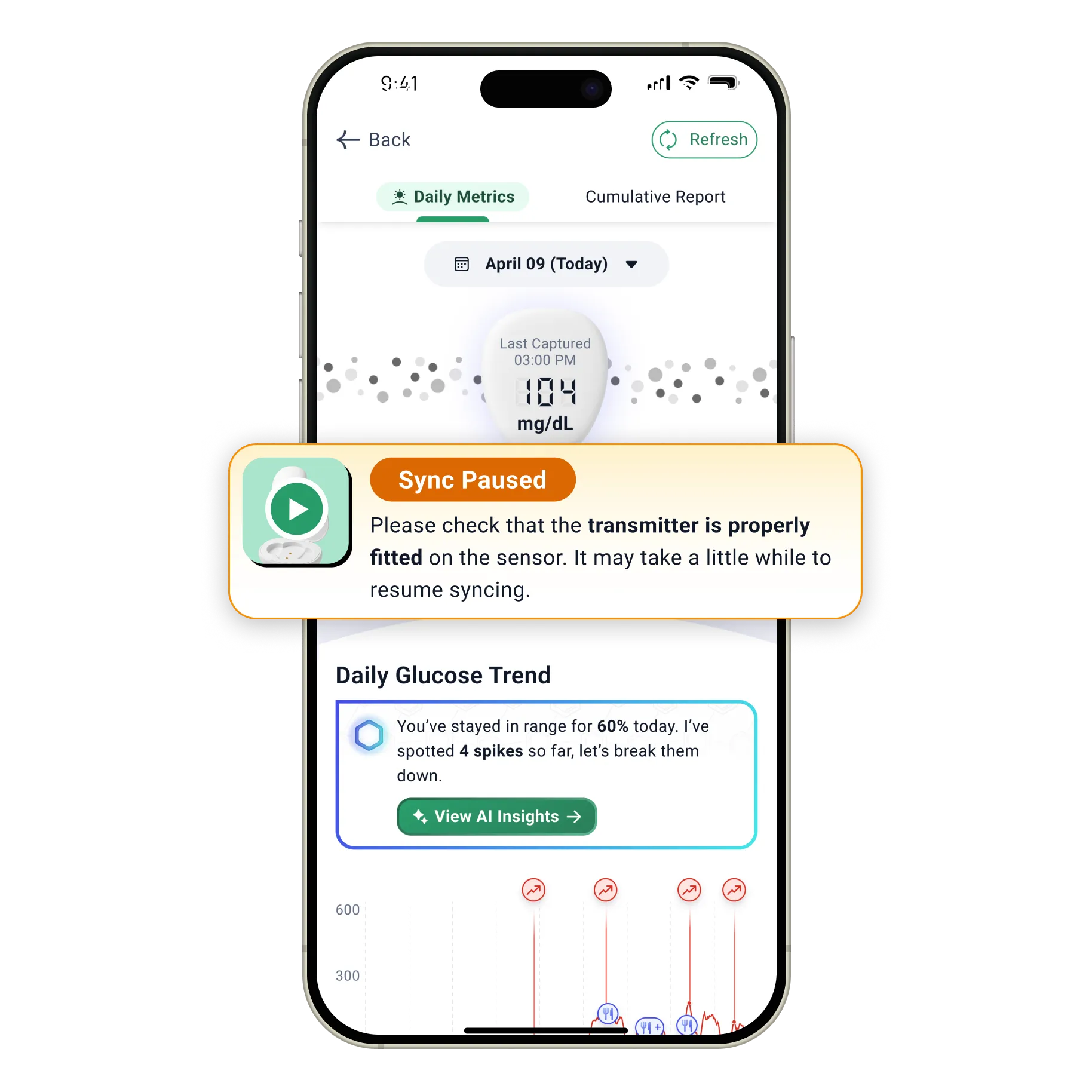
Designing for failure, not just success
The error states weren't an afterthought. Building them as a
reusable system meant that when we later designed for other
devices like the Ring, the same failure-handling was already in
place to catch issues early.
Who reaches for which view
The Seeker connects to Daily.
The Changer connects to Daily and Cumulative.
The Clinically Fluent connects to Advanced.
The Seeker→ Daily
The Changer→ Daily, Cumulative
The Clinically Fluent→ Advanced
One person's advanced view is another's home screen. All three start
from the same daily glucose, they split on how deep they go, and why.
Problem statement
Users dealing with metabolic conditions often rely on advice from
experts and have to continue doing dedicated tasks with discipline,
without any visible progress for significant periods of time. The
CGM gives users the ability to track their body's vitals and build
more personalized plans.
The challenge here was to design an experience that created meaning
out of medical terms for the average user without overwhelming
them, keeping in mind that GoodFlip was aiming to serve a wide
variety of users with different needs.
Why CGM
CGM was a product call, a commercial one. A standalone SKU in a growing
market (BeatO, Ultrahuman, SugarFit) with a natural 15-day repurchase cycle.
The business case was sound.
But a business case greenlights a product. It doesn't make it worth wearing.
So before I designed against the call, I pressure-tested it: does continuous
glucose actually change how someone experiences their own body, or is it just
a device we sell every fifteen days?
I backed it once I was sure it was both.
Here's what convinced me.
User
You see your own glucose patterns and catch spikes early. You know where you stand today, instead of waiting six months for a lab to tell you.
Product / ecosystem
It fills the silence between six-month lab tests. Your effort finally has a mirror in the moment, not a verdict half a year later.
Clinical / coaching
Your coach acts on real days, not twice-a-year snapshots, so the guidance fits the life you’re actually living.
I got close from three distances
Before I designed a screen, I got close to this product three ways: the domain, the device, and the whole journey.
Understand the domain
Build a basic understanding
How the body handles glucose, and what the market already does.
→ A clear read on what BeatO, Ultrahuman, SugarFit get wrong.
Sit with the clinical team
I sat through calls with doctors and coaches to understand how they read CGM data.
→ Three things reshaped the entire information architecture.
People panic easily
Any graph going downwards, even on a daily timeline, triggers users into thinking something is wrong.
Experts read cumulative
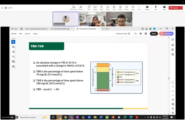
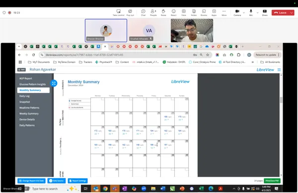
Doctors look at 15-day aggregates: TIR, TAR, TBR. That is their source of truth, not the daily graph.
Experts simplify for users
When talking to patients, doctors use easy-to-understand parameters and keep the clinical metrics for expert eyes only.
The data has depths different people can read, and others can't.
Live it
Wear it for 15 days
I put a sensor on my own arm for the full cycle.
→ Three things surfaced that no research would have.
Install
Harder than the manual admits. I fumbled it myself.
Errors
Not edge cases. Dropouts, moisture, vanished readings.
Nudges
The one thing that genuinely helped.
The hardest problems weren't in the data. They were before the app showed a number.
Map the whole journey
Map it end to end
The journey starts at an advert, not the app: ad, purchase, delivery, connection.
→ I answered every question at the moment it forms.
The journey begins before the product does, three ways in.
Every failure I mapped became a screen: the manual QR fallback, the warm-up state, the sync-paused message.
The user walks one path from an ad to a glucose reading. They never see the four teams behind it.
Three distances, one realization: the person fumbling the install, the person the nudge rescued, and the clinician reading AGP aren't the same person. The same screen can't serve all three.
From here, everything went into wireframes, the part I owned end to end.
One product, three readers
A CGM produces around fifteen metrics, and the people reading them aren't the
same person. All three start from the same daily glucose. They split on how
deep they go, and why.
glance · todayhow deep the reader goes →clinical · trends
shared core
The Seeker
The Changer
→ doctor
The Diabetic
Avg glucoseTime in rangeToday's trend
Weekly trendsShare
AGPSDVariabilityTIR trends
EducationPlain languageEncouragement
Today
The Seeker
Self-directed. No diagnosis.
Did I stay in range today?
Daily
Glanceable home. Current glucose, daily average, time in range.
This week
The Changer
Guided by a doctor. Reversing insulin resistance.
Is the trend bending, and can I show my doctor?
Daily
The same glanceable home, the shared starting point.
Cumulative
Progress across fifteen days, built to be shared with a coach.
Long-range
The Clinically Fluent
Years of CGM. Reads clinical data natively.
How does today compare to last Tuesday?
Advanced
The clinical layer: AGP, variability, SD. The view shared with a doctor.
Design for the average of these three and you overwhelm the Seeker and
underserve the Clinically Fluent. So I stopped designing one screen and
metered the depth instead.
Inside each view I made one more call, metric by metric. Show it, simplify
it, or hold it back.
The per-metric call
Metric
Call
Why
Time in range
Show
Upfront, never buried. The one number that answers am I okay.
GMI
Simplify
Renamed “Glucose Estimate” with a tooltip. The acronym means nothing to most people.
Max fluctuation
Withhold
Held back from the everyday user. A lone alarming spike doesn’t inform them, it frightens them. It lives in the advanced view, where a coach reads it in context.
The question was never how much to show. It was what each person could act
on, and what would only scare them.
Then I looked at what happened
Six weeks after launch, the February 2026 data was in. I only claim what
it can hold, so here’s what held.
77.6%
Finished setup: most onboarding bleeds users at every step. This mostly didn’t.
Context
218 of 281, ten-step two-part pairing flow. The 22% who fell = the same two-part device that bit us after launch.
78%
Still using it at day 14: they came back to read their data daily.
Context
Held to day 14. Beyond that the cohorts thin and the number stops being trustworthy, so that’s the ceiling I claim.
42%
Opened the day-glucose explainer, the most-opened content on the dashboard.
Context
People didn’t just glance at numbers: they stopped to learn what they meant. The one decision I most wanted to be right about.
The dashboard held. The onboarding was where reality pushed back.
The device didn’t behave
Setup completion said 77.6%. What it didn’t say: some of those completed
setups started coming back as replacement requests. The data looked clean.
The device, in people’s hands, wasn’t behaving.
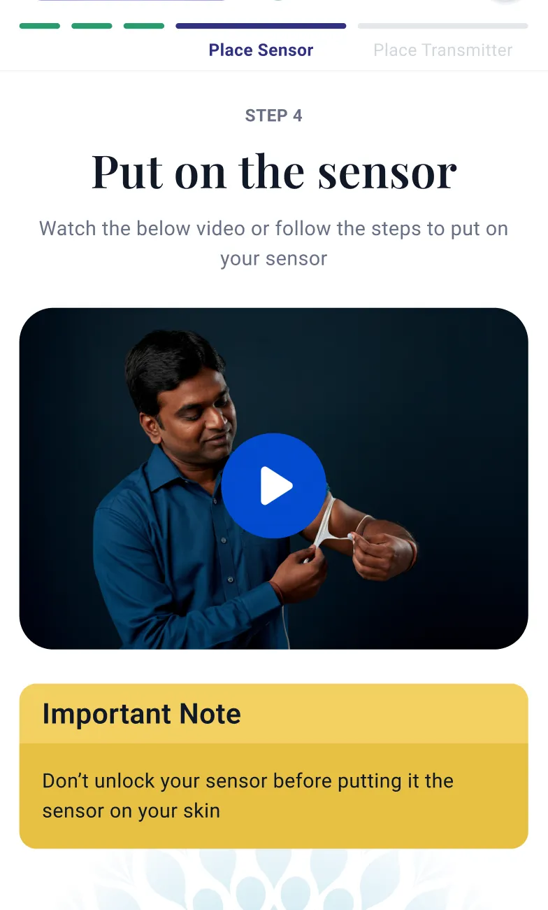
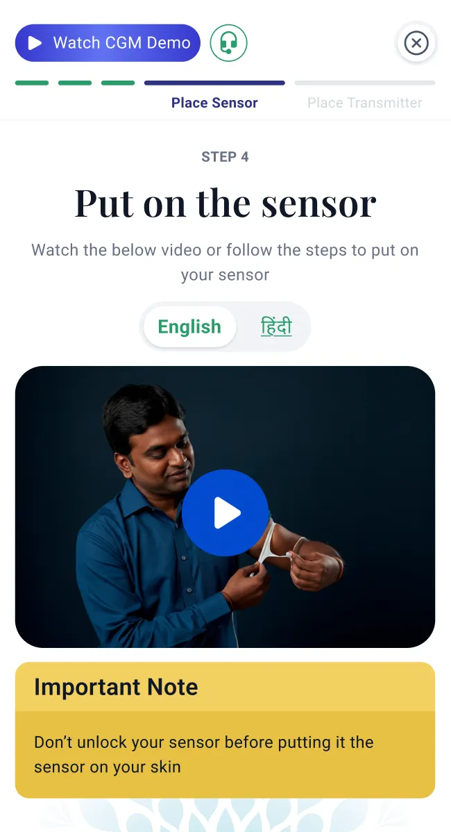
The complaints traced to one thing. It’s a two-component device (sensor and
transmitter, assembled by the user), and despite clear instructions, people
couldn’t tell when it was seated correctly. Data wouldn’t show, or they’d
installed it slightly wrong, or it wasn’t attached properly.
The root cause wasn’t the instructions. It was the mental model. Our
audience was used to a single-piece, stick-it-on-and-forget device. A
two-part assembly was a category they’d never met, and no amount of
on-screen copy fixed a hardware expectation. (The funnel had already
whispered this: transmitter detection was the one cliff in setup.)
Two responses, each matched to a specific failure
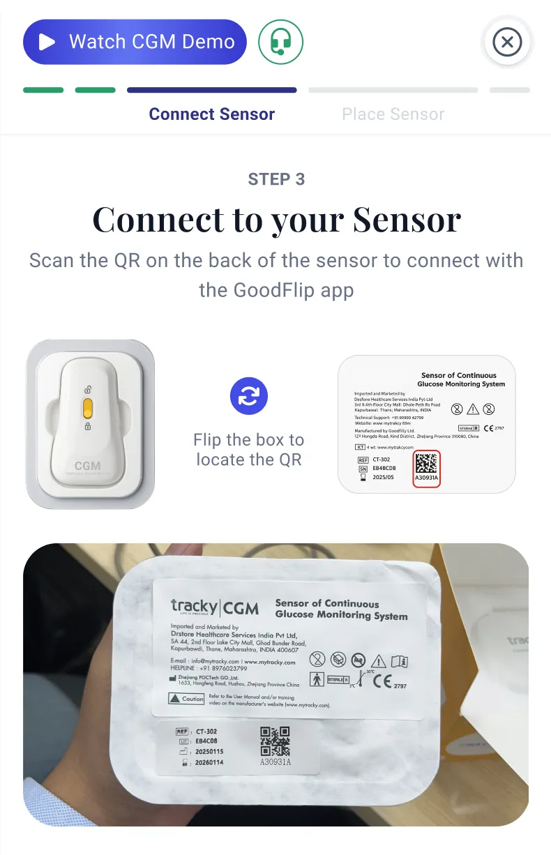
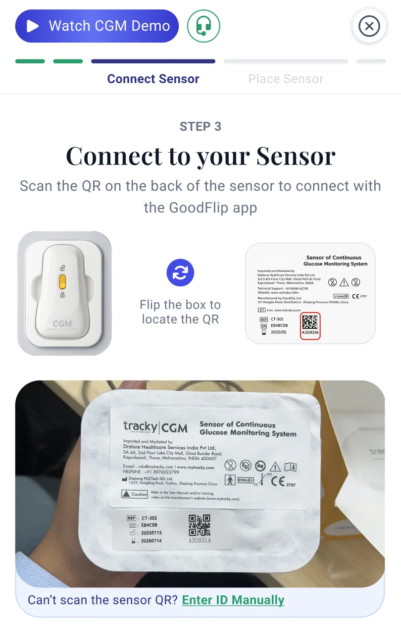
The QR scan kept failing
On the sensor mapping step, so I added manual code entry as a fallback.
Before
After
Older users were arriving in numbers we hadn’t designed for
So I translated the whole flow to Hindi with a language toggle.
Before
After
Killed idea
I also pitched the more ambitious fix: use the phone camera as a live
install assistant, guiding the user through seating the device in real
time. I built a working demo. We killed it: dev bandwidth was thin, and
more seriously, nobody could answer what happens if the assistant tells
someone it’s seated correctly when it isn’t. On a medical device, a
confident wrong answer is worse than no answer. So it stayed a prototype.
Building a better relatability for users with Kaira AI
Let's continue our story from above. Imagine that you are now able to
track your blood glucose levels and see glucose fluctuations with
every activity (eating, exercising, waking up, etc.) you do. You now
have visibility, but your curious self wants to know more.
How is it that a banana can spike my glucose so much?
Are these spikes normal?
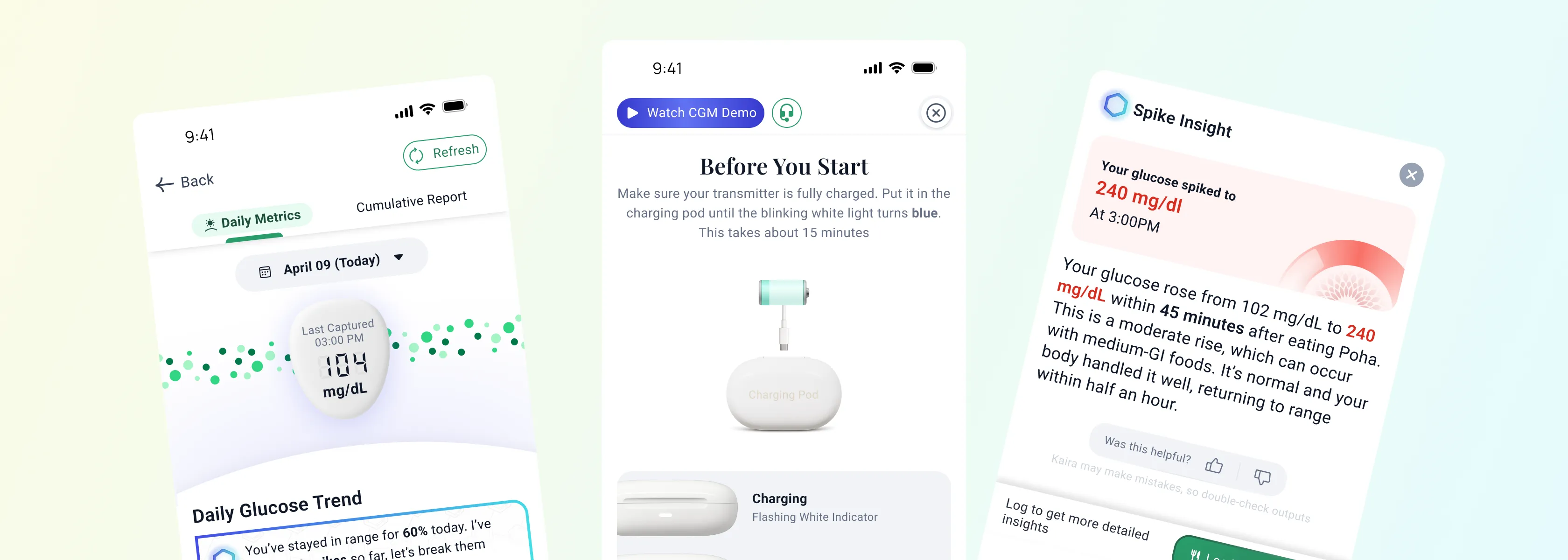
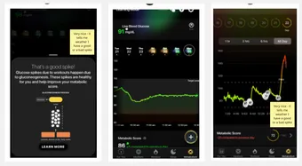
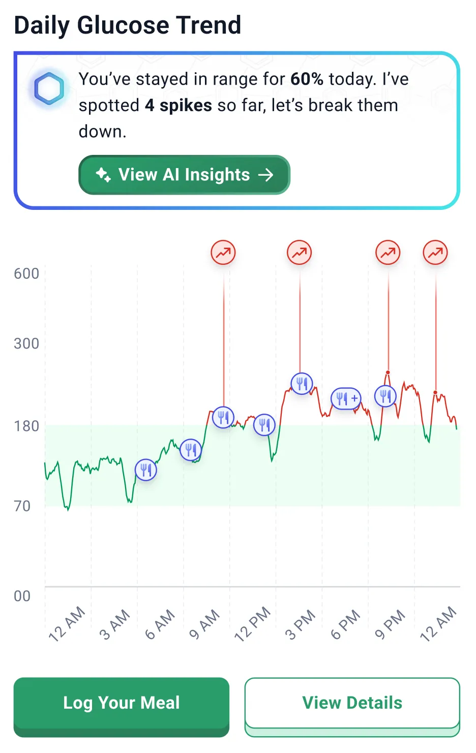
Kaira on the CGM graph: food marked on the curve, and the plain-language
insights users open.
I figured there had to be a way to answer these questions a user
might naturally have. This is where we introduced Kaira on the CGM
dashboard, with the following aims:
Provide insights to the user that helped them understand why things are happening the way they are, not just what.
Create a habit of food logging, allowing users to track meals as well, because what can be tracked can be improved. We used the Hooked Model to achieve this.
The Hooked Model
Trigger
A notification or Kaira's message on the CGM dashboard.
Action
Log a meal using Kaira, or manually.
Variable reward
Receive instant insights about why spikes are happening.
Investment
Daily meal logging that results in better overall understanding and guidance.
26%
of all logging starts came through the CGM screen, the second-largest
food-logging doorway in the entire app, behind only the nutrition
screen built specifically for it. A glucose dashboard turned into one
of the product’s primary places to log a meal.
This project was really special. It put GoodFlip on the map alongside
other health-tech platforms. From a design perspective, I gained
experience drafting data-rich experiences that people actually use and
enjoy.
A designer is always stuck in a perpetual loop toward perfection, and
the team is already taking significant steps toward a more robust
experience. Some of my ideas and the work ahead include the following.
What's in the pipeline?
What am I actively pitching to the team?
What's my north star?
A better report-sharing experience, letting professionals handle multiple patients without being overwhelmed.
Kaira gaining the ability to have two-way engagement with the user.
The whole product argued "show the right depth." The next bet is
that showing isn't enough. Next, the system should be smart enough
to customize a plan that actually helps you make valuable
lifestyle changes.
As a designer, I want users to actually understand how they're
performing, and to communicate a motivating, transformative
message through my work. I'd like this to become the definitive
experience for viewing CGM data for everyday users, and a
standard across the industry. We're far from that goal, but a
designer can dream.
What did the users have to say?
I had actually been misdiagnosed as diabetic, but using the CGM, I
could closely monitor and confirm my readings. My HbA1c came down
to 5.8, and I was able to see that I was pre-diabetic due to
insulin resistance, rather than diabetic. The visualization chart
they provide is excellent and very helpful.
I have used both HealthifyMe and SugarFit CGMs, but I found
GoodFlip's CGM to be far better than those two. The tracking chart
generated in the GoodFlip app is very good. Unlike other systems,
I don't have to repeatedly scan with NFC, and there are none of
the Bluetooth disconnection issues. The product is really, really
good. I have no complaints.